
Seaweeds and cyanotypes have been exercising my mind a lot recently. Meghan Riepenhoff and Anna Atkins have both produced terrific outcomes in very different ways. I discovered, at a recent exhibition “Sea Gardens” at RAMM, Exeter (November 2019), that a vast range of algae caress our South Devon shores so I ventured to experiment, first with small sheets of cartridge paper, then with 1.5m lengths of wallpaper lining. The resultant cyanotypes are here.
It was after I had posted on FB some of the vignettes that I had isolated from my latest painting like these:


Fellow artist Richard Sunderland, contacted me to say that the work reminded him of the pliage work of Simon Hantaï. As I was not familiar with it, I was intrigued with his work on the Gagosian website so I tried it myself. The word plague means folding in French.
I took a section of my wallpaper lining paper, scored some straight lines on it, and then scrunched it as Hantaï would have done. Then, instead of painting the exposed facets, I painted them with molten wax, opened up the paper and covered it in cyanotype salts.
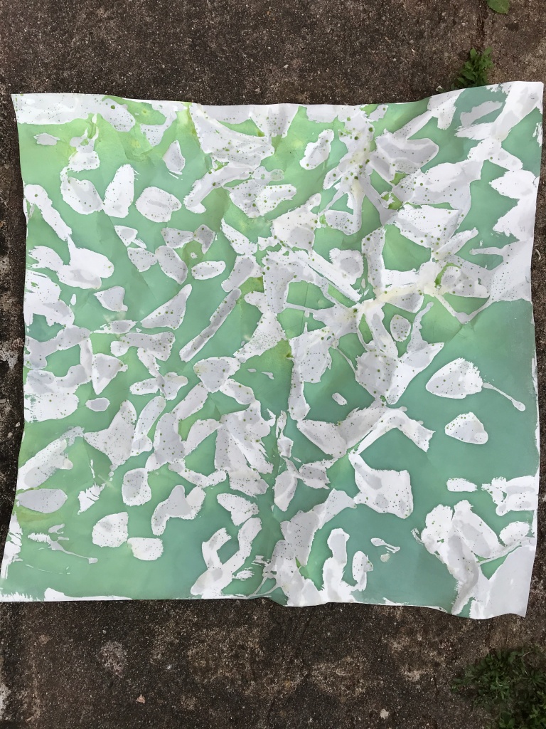
When it was dry, I exposed it to a UV lamp, opened it and ironed out the wax and was left with this:

The straight lines are not immediately visible, you have to look for them. I knew I wanted to pain the white spaces but I didn’t know how I would do that so I left it for a while and got back to it some 3 weeks later when I thought I would approach it as a stained glass window. I started with a green belt, thinking I would do a landscape and combined yellow and blue acrylic paint very roughly and applied the paint so that the brush strokes would show. I also made the decision to paint contiguous sections the same colour.
I also made the decision that I would mix the 5 colours and that I would not use single colours except for a small patch of black and another of red. there was no rationale for that, just an intuition that that’s what I would do.

This is the resultant piece, backlit on a window by the sunshine.
I realised then that the more important bits for me were smaller sections of the piece:


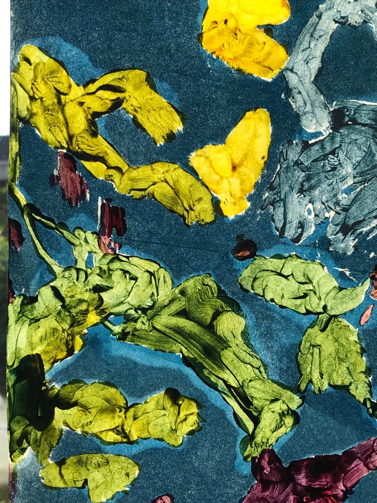

Reacting to the experiment, Richard commented: “The contrast between warm and cool colours adds spatial dimension to the composition. I started thinking of Van Gogh ![]() sunflowers. Something to do with your mark making.”
sunflowers. Something to do with your mark making.”
On reflection, I liked these smaller sections because they reminded me of the seaweed on the treated cyanotype sheets printing in the sun:


I am very grateful to Richard for having put Simon Hantaï on my radar because it allowed me to experiment in ways I would never have tried.

Anna – are you familiar with Renata Buziak (http://renata-buziak.com/about) and Judith Crispin’s work (https://judithcrispin.com/)?
LikeLike
Thanks, Lynda. They are really super artists to explore. I shall look at the work in more detail tomorrow.
LikeLike
I really love the Buziak work and its parallel links to life and decay! I have been meaning to try time lapse for ages and she has just given me the impetus to try it. Crispin’s tree work really speaks to me and her poetry, although it takes some getting used to, is quite unique. Thanks again, Lynda.
LikeLike
These are wonderful Anna and I love the vibrancy of them. I’ll be checking out the links as well – thanks to Richard and Lynda.
LikeLike
Thanks Catherine. I am trying to learn from these too.
LikeLike